GK Senses
OUR ROLE
– Branding
– Packaging
Mother Nature, an inexhaustible source of inspiration, creates a new line of natural cosmetics for the care of women’s skin. This is how branding for the new line gk senses natural cosmetics was born. The graphic design of the logo combines the illustration of leaves and flower buds with the liquid form of a drop of organic essential oil.
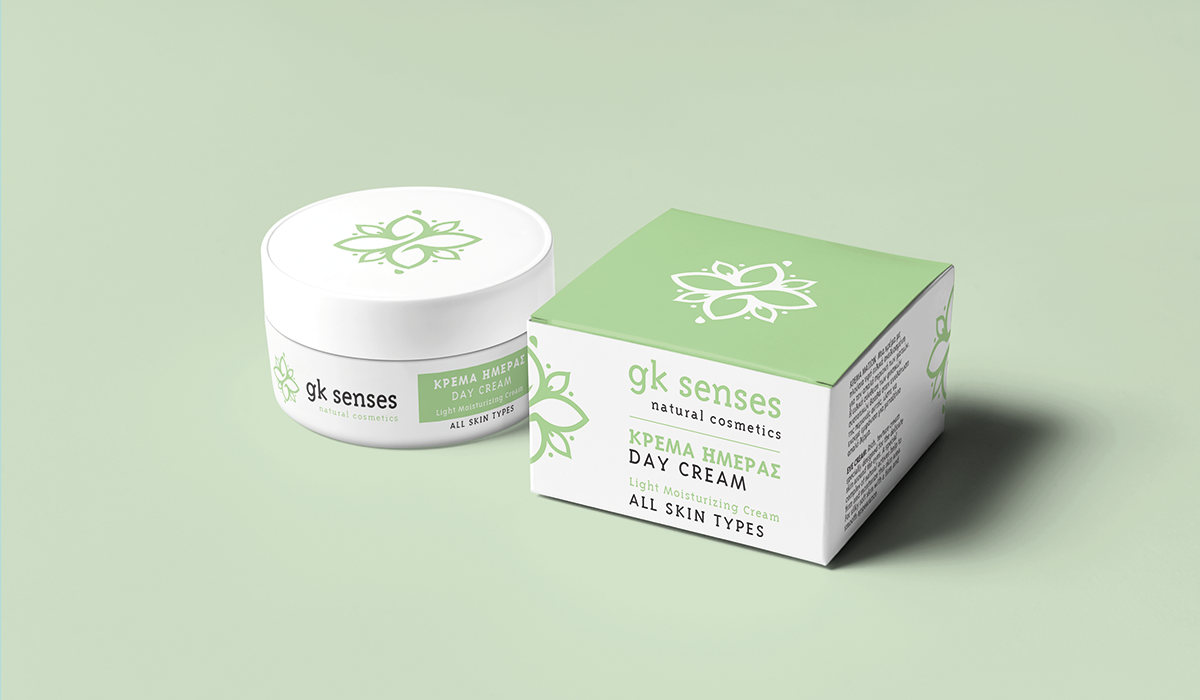
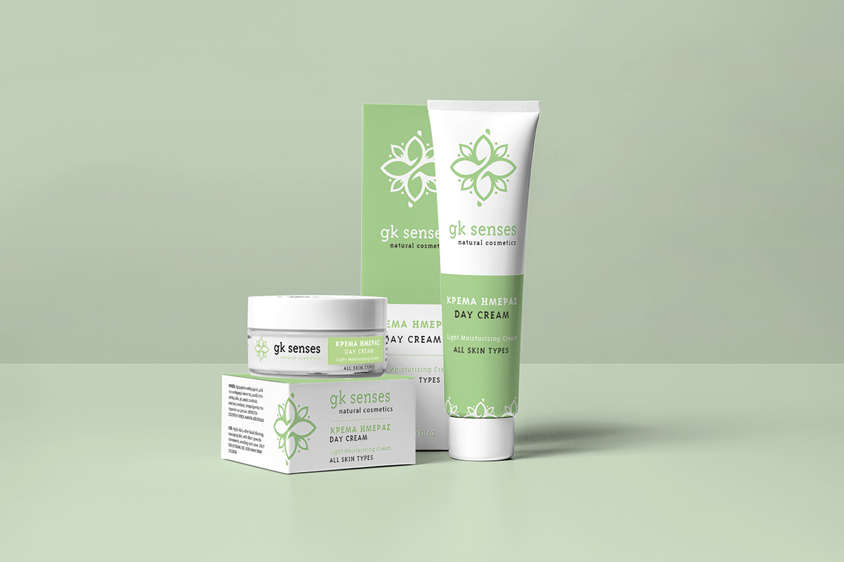
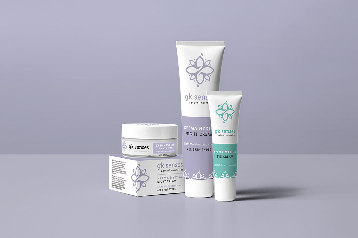
Thus, the pure natural ingredients used in the gk senses natural cosmetics line play the leading role in its branding. The logo works with the eternal potential of a mandala, and becomes a microcosm encompassing the secrets of the universe. This immaculate purity was also creatively included in the design of the cosmetics packaging with white color dominating in the background.
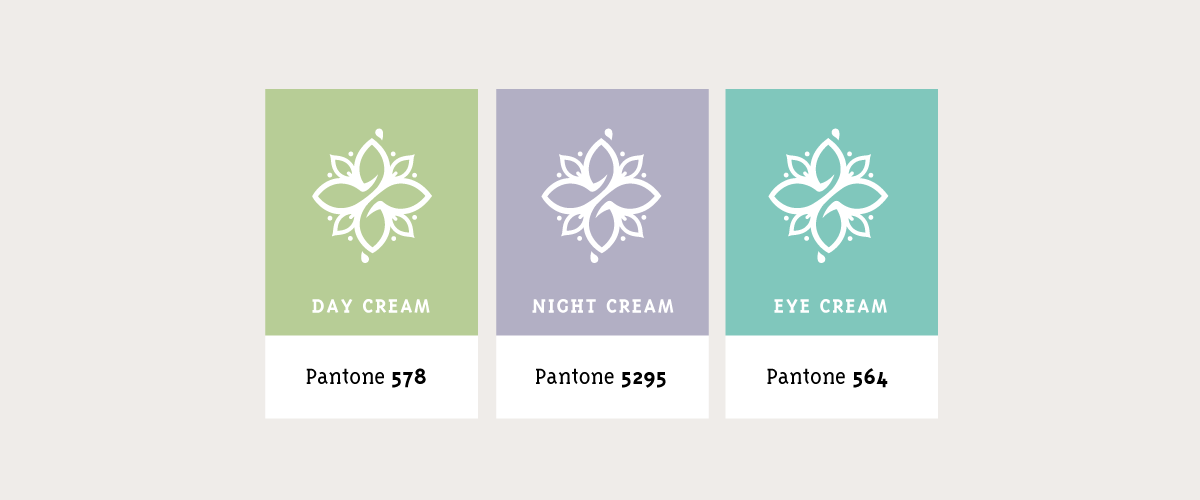
The features of each product are clearly legible. Having selected romantic pastels for each code in the line gives gk senses products a sense of lightness and freshness. Moreover, it makes the products easily distinguishable one from the other.
Idea


Colors
Packaging
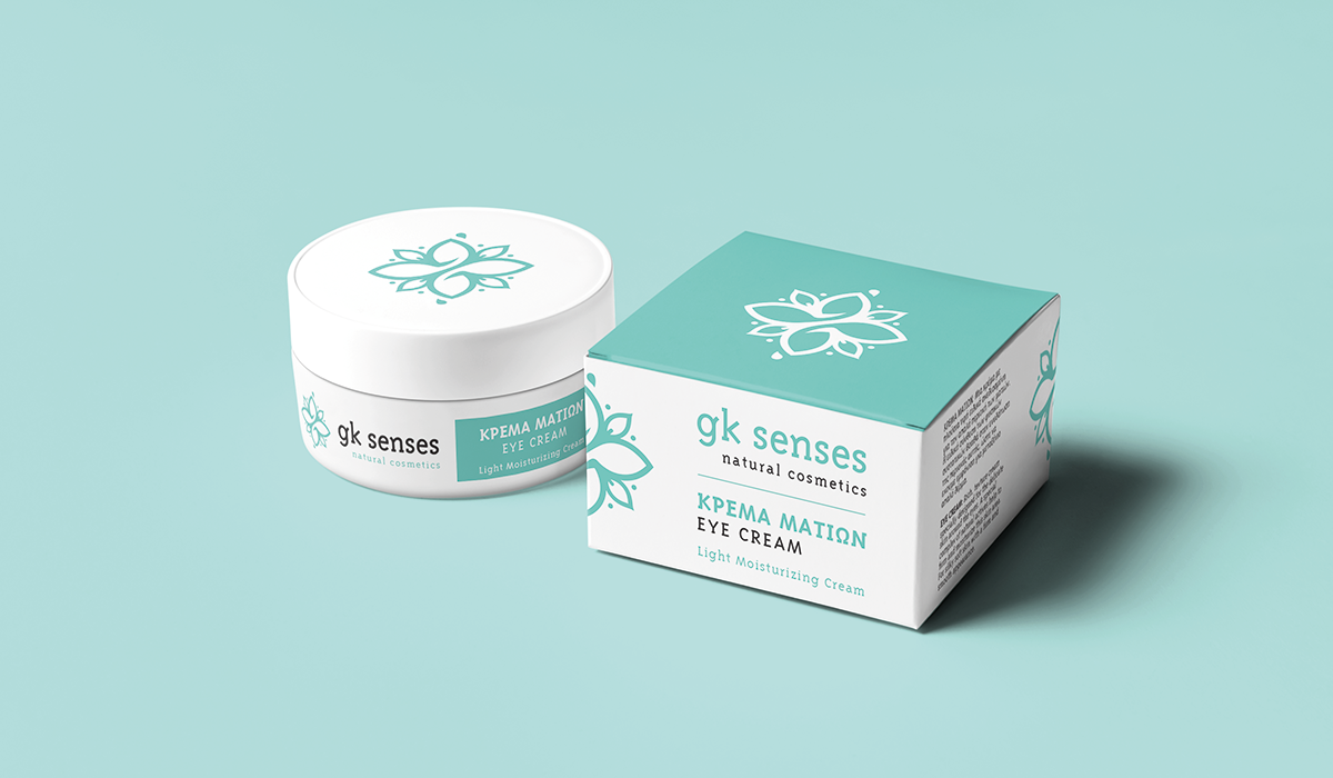
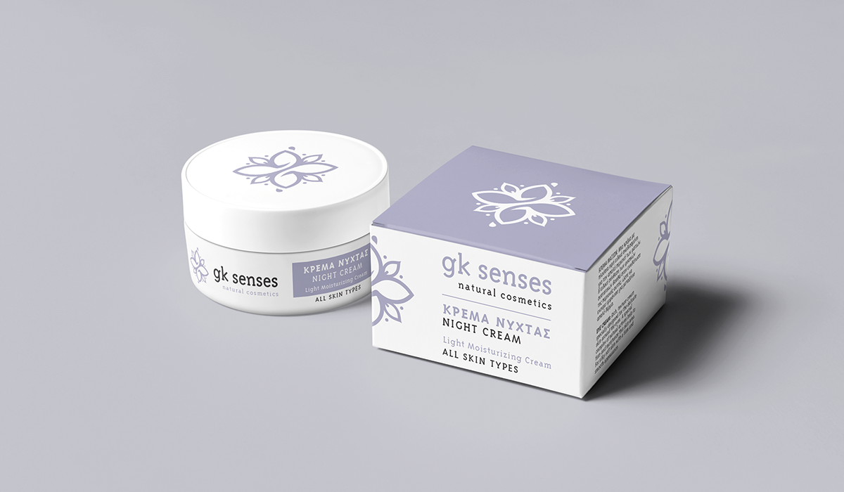
The logo works with the eternal potential of a mandala, and becomes a microcosm encompassing the secrets of the universe.


Get Social