Chryssis Bros & Co company has been active for almost half a century in the field of development of high-standard construction projects in the wider region of Attica.
Going into the digital age the company had the chance to re-establish and , thus, relaunch its corporate identity.
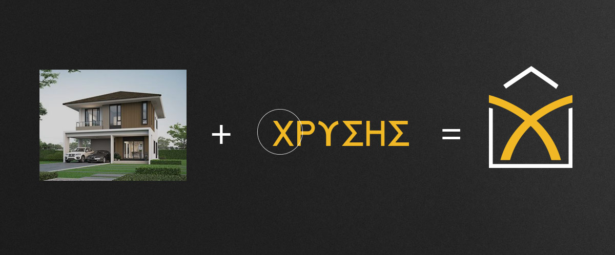
The main concept behind the new logo was the commercial objective of the company – that is, construction or building of a new home in a wider sense. The linear austerity of the house symbol is supported by “beams” as in the initial letter of the family business surname in Greek, X. The golden-yellow color used in the corporate identity is also theme related to the name Chryssis, which is Golden in English, while the navy blue-gray pantone in the background signifies prestige, trust and stability, values of uppermost importance in the company’s code of ethics.
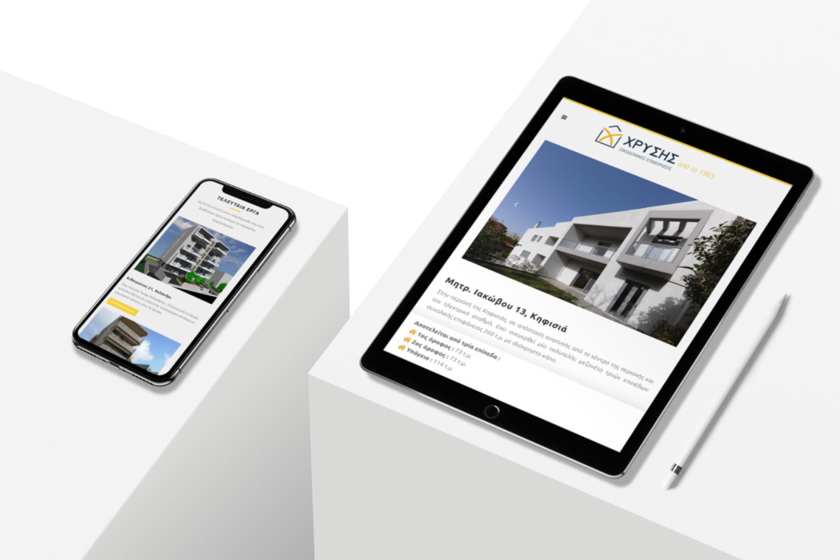
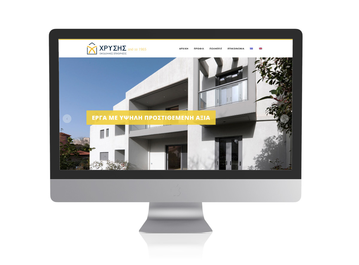
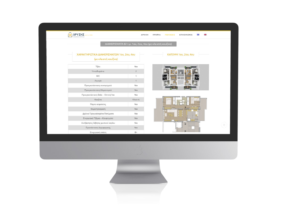
The responsive site of the company follows the modern aesthetics of simplicity and features of user-friendly browsing. It contains all the new or under construction projects, portrayed through a wide range of photographs and three-dimensional mock-ups and all the important details a potential buyer wants to know about.

Idea

Colors

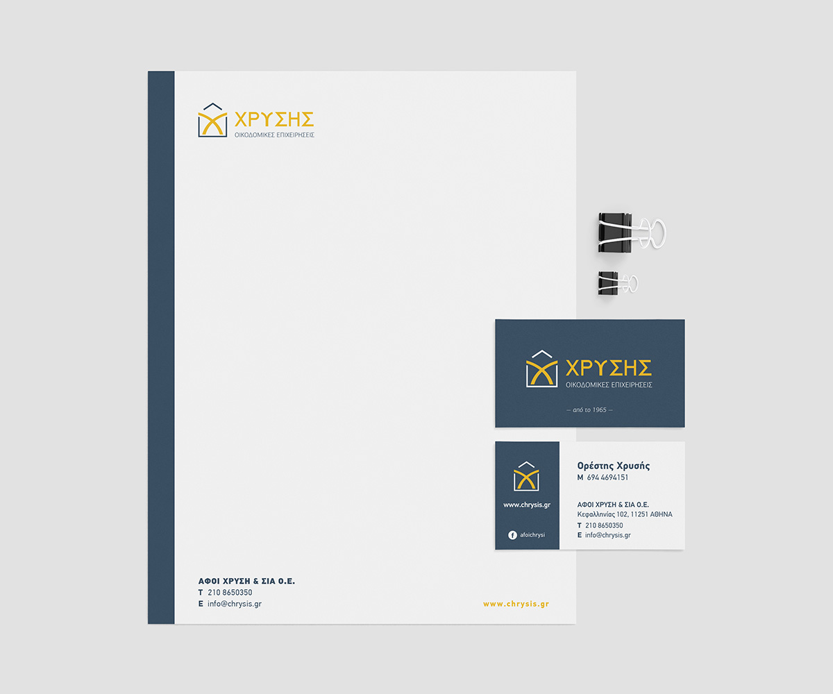
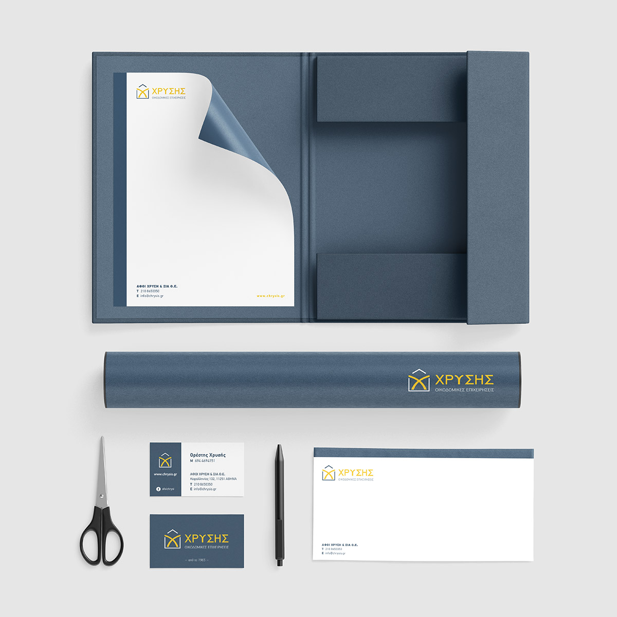
Corporate Identity
Website






Get Social