KVST
OUR ROLE
Branding
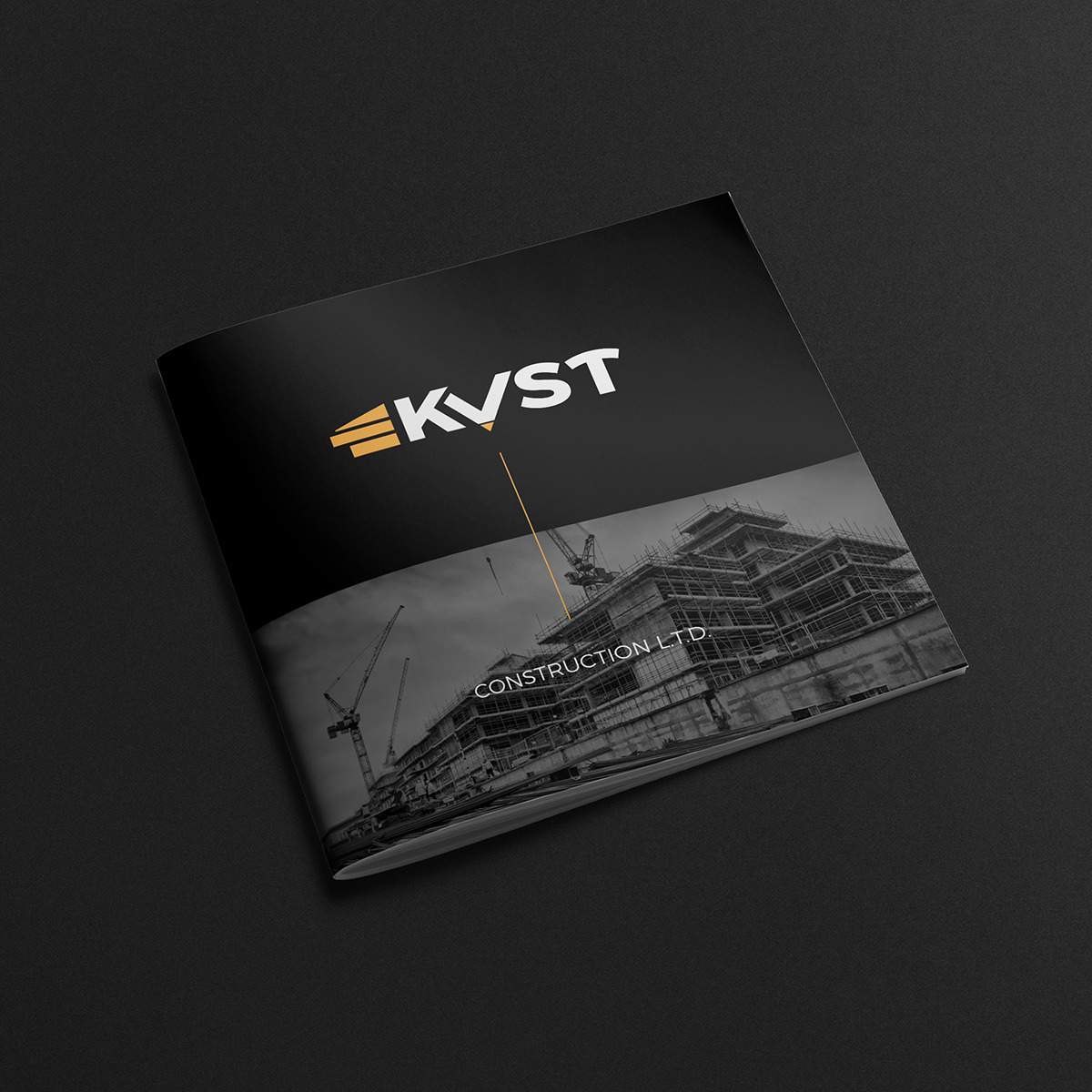
Aspiring to become a model company in its field, KVST Construction Company-based in Nicosia, is active in the construction market. We designed the company’s branding drawing inspiration from KVST Construction’s scope of work. The idea was to combine the linear architectural design of a building with the company name, the acronym KVST.
On a second design level, the brand’s V is partly colored like the geometric symbol of the logo and artistically takes the form of the “check” symbol. This demonstrates the trust and credibility KVST offers to its customers. The color palette used to create the logo as well as the development of the corporate identity enhance the modern character and prestige of the company.
Idea

Colors
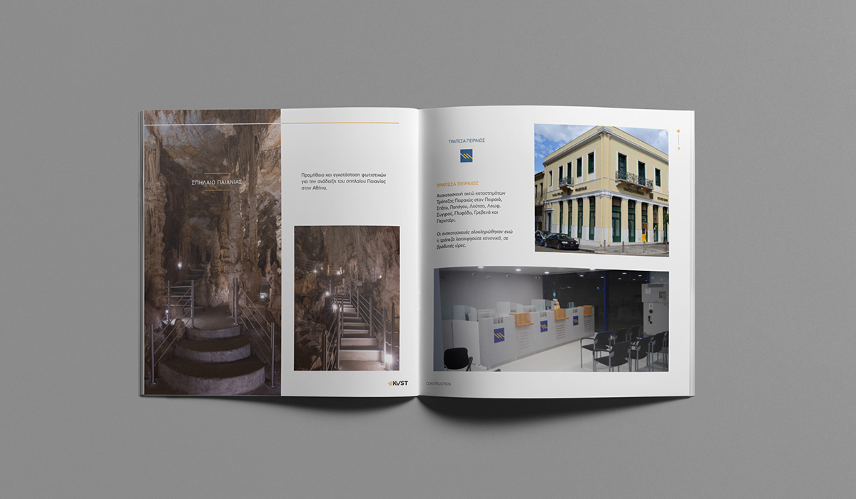
Corporate Identity
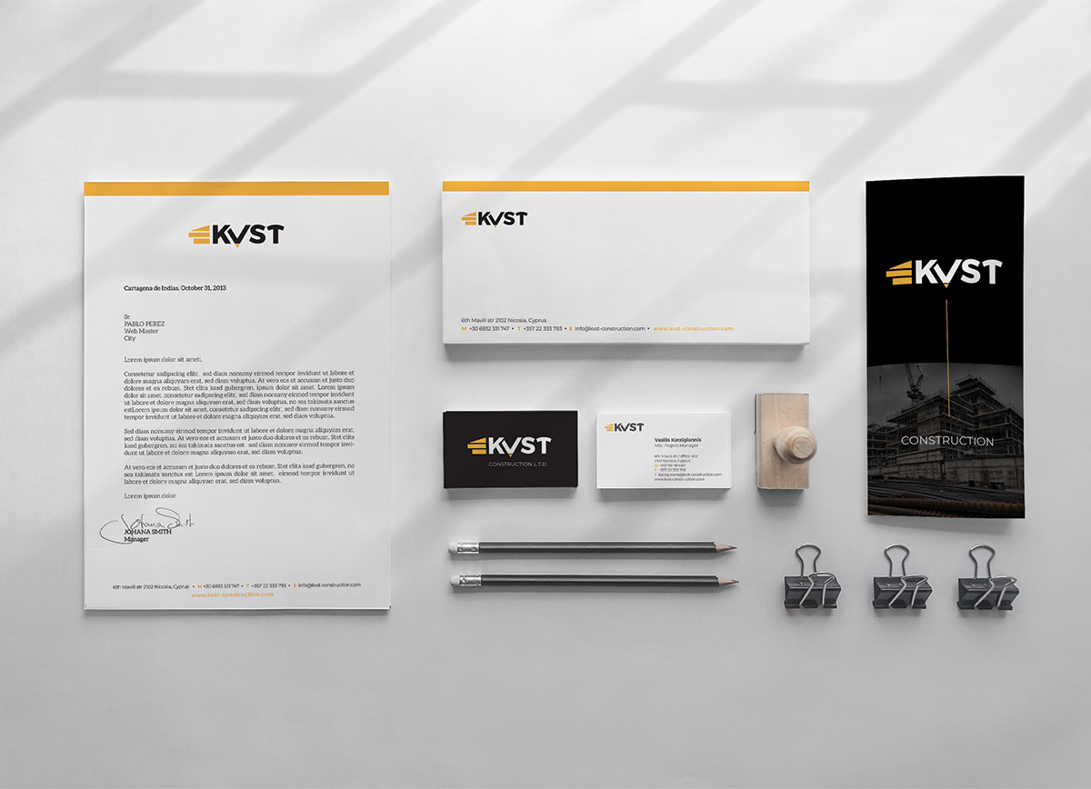
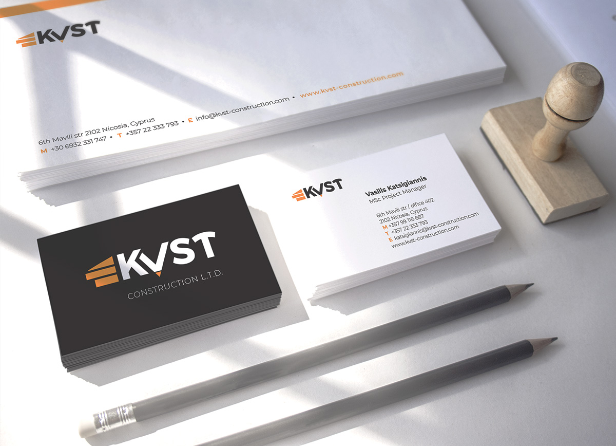
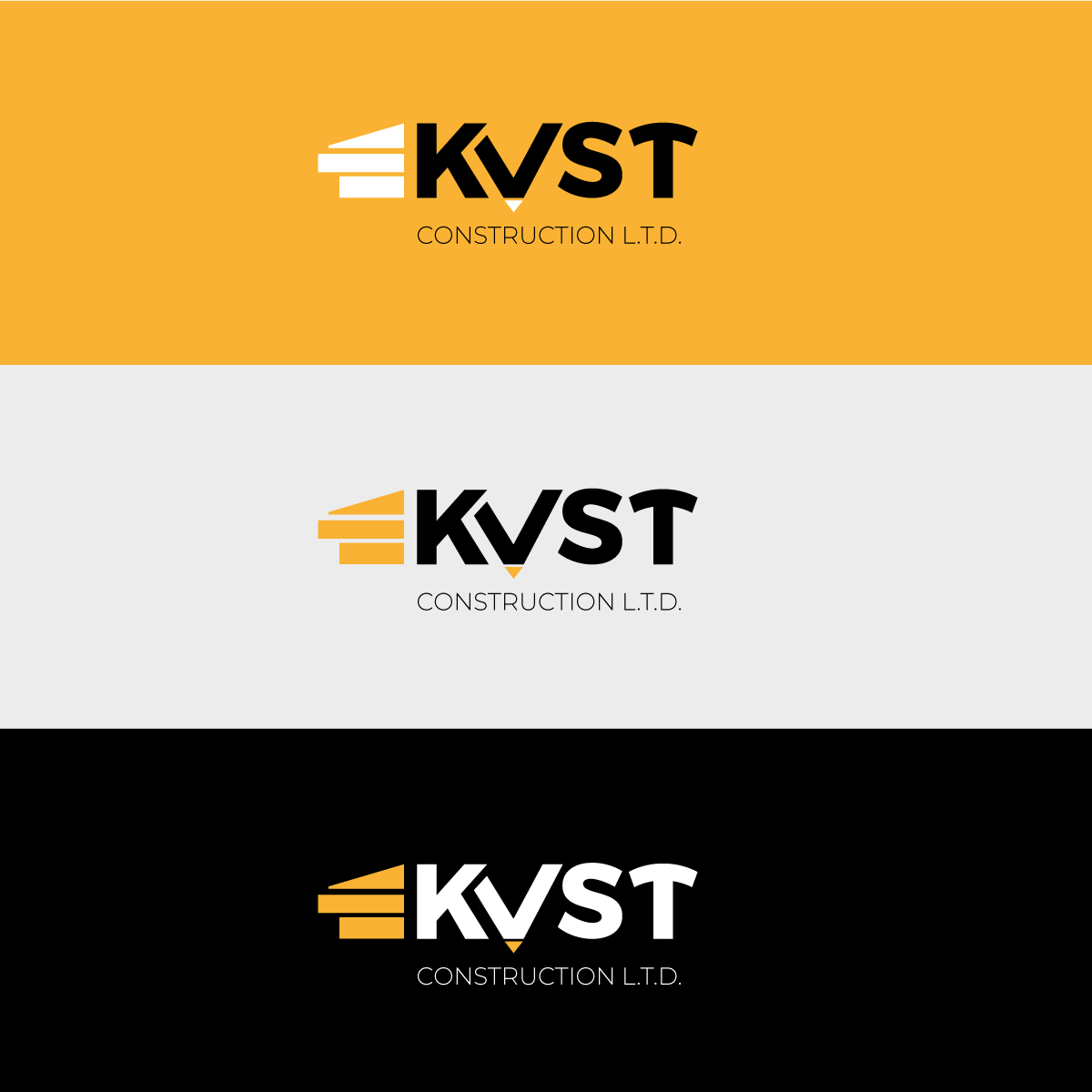
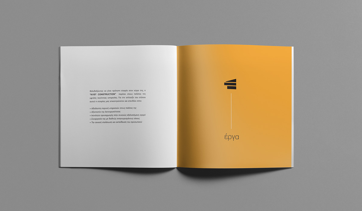
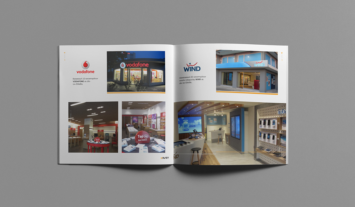
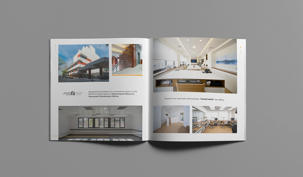
The color palette used to create the logo as well as the development of the corporate identity enhance the modern character and prestige of the company.


Get Social